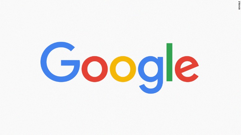
CALIFORNIA (Web Desk) – First they changed their name, now they’ve changed their logo. Google introduced a new sans-serif and slightly toned-down four-colour logo on Tuesday in the biggest redesign since 1999.
Google said the new design would soon be seen across all its products. Google’s homepage introduced the redesign with an animation that wiped away the old logo and drew the new one.
“Google has changed a lot over the past 17 years – from the range of our products to the evolution of their look and feel. And today we’re changing things up once again,” the company said in a blogpost.
The company said the redesign was meant to reflect the way that people interact with Google products across many different platforms, apps and devices.
“It doesn’t simply tell you that you’re using Google, but also shows you how Google is working for you. For example, new elements like a colorful Google mic help you identify and interact with Google whether you’re talking, tapping or typing. Meanwhile, we’re bidding adieu to the little blue ‘g’ icon and replacing it with a four-color ‘G’ that matches the logo.”
The logo has undergone many, mainly small, changes in its history. The colours have changed, 3D letters have been flattened, and an exclamation point came and went in 1999.
The move comes just a month after a major restructuring of the company was unveiled. Google is now owned by Alphabet, a holding company created by founders Sergey Brin and Larry Page to separate their money-making search engine company from the loss-making, “moon shot” projects like robot cars, medical research and internet-delivering balloons.


