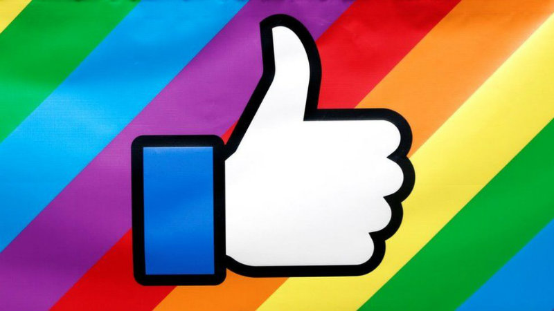
SILICON VALLEY – Facebook has redesigned its now familiar like button with a new look. The new like button drops the company logo in favor of a new thumbs-up icon.
If you’re on Facebook, chances are that you have used the Like button before. It is the little blue rectangle featuring the social media company’s “f” logo that you hit to celebrate a friend’s engagement news or show approval for a link someone has shared.
But now Facebook has ditched the old logo, making way for a thumbs-up instead. The new social media buttons come with cleaner design, backwards compatibility and can be integrated into Instant articles as well.
Now you can do more than just ‘Like’ a Facebook post
“Our hypothesis was that more people would understand the thumbs up icon on the Like button, so we conducted qualitative and quantitative tests to measure them side-by-side. The results revealed an increase in engagement, so we are switching the Like button from the Facebook “f” logo to the thumbs up icon,” Facebook said in a blog post.
Facebook “dislike” button has finally arrived- in the form of six new emoji
The social media giant has also revealed new mobile-friendly social plugin buttons. Facebook will also let developers set button sizes according to the one that suits their site.
Facebook has also announced new share and save extensions for the Google Chrome browser. The Share to Facebook extension will allow people to share any link on the web with their friends on Facebook, Groups and Messenger.


