Google has finally unveiled Android 8.0 and here are the things you need to know. Developer previews have been available for months but now it’s out for the public. Much to the dismay of Android users, the new version won’t be available on all devices.
The User Interface (UI)
The user interface hasn’t changed all that much. Everything is still material design, the theme is still similar and moving around the UI is exactly the same as Android Nougat, which in turn wasn’t much of an upgrade from android Marshmallow. The app drawer still exists, as some phones like the LG G5 and many others do not include it at all. The settings menu is also at its usual spot and the quick settings were relatively the same.
Those familiar with the system will not have any trouble moving around. There are some changes though, the most noticeable being the settings menu. Many of the settings have been renamed, moved around and consolidated in an attempt to make things a little bit easier.
For instance, the slide-out drawer from the side has been removed and many of the sub-menus have been redesigned. The much request apps and notification settings, which were confusing from the start of android have been vastly simplified. Most of the stuff can be seen in one sub menu instead of being under multiple.

The settings are much simpler now but Samsung had already done that since android 6.0, so it’s wrong to say that Google took some design cues from Samsung. There are also some other small changes like a slight font change, a slight design change on the lock screen, and changes in the notifications. Several applications have new icons and the status bar is slightly altered. These are all excessively miner but do make a difference over a long period of time.
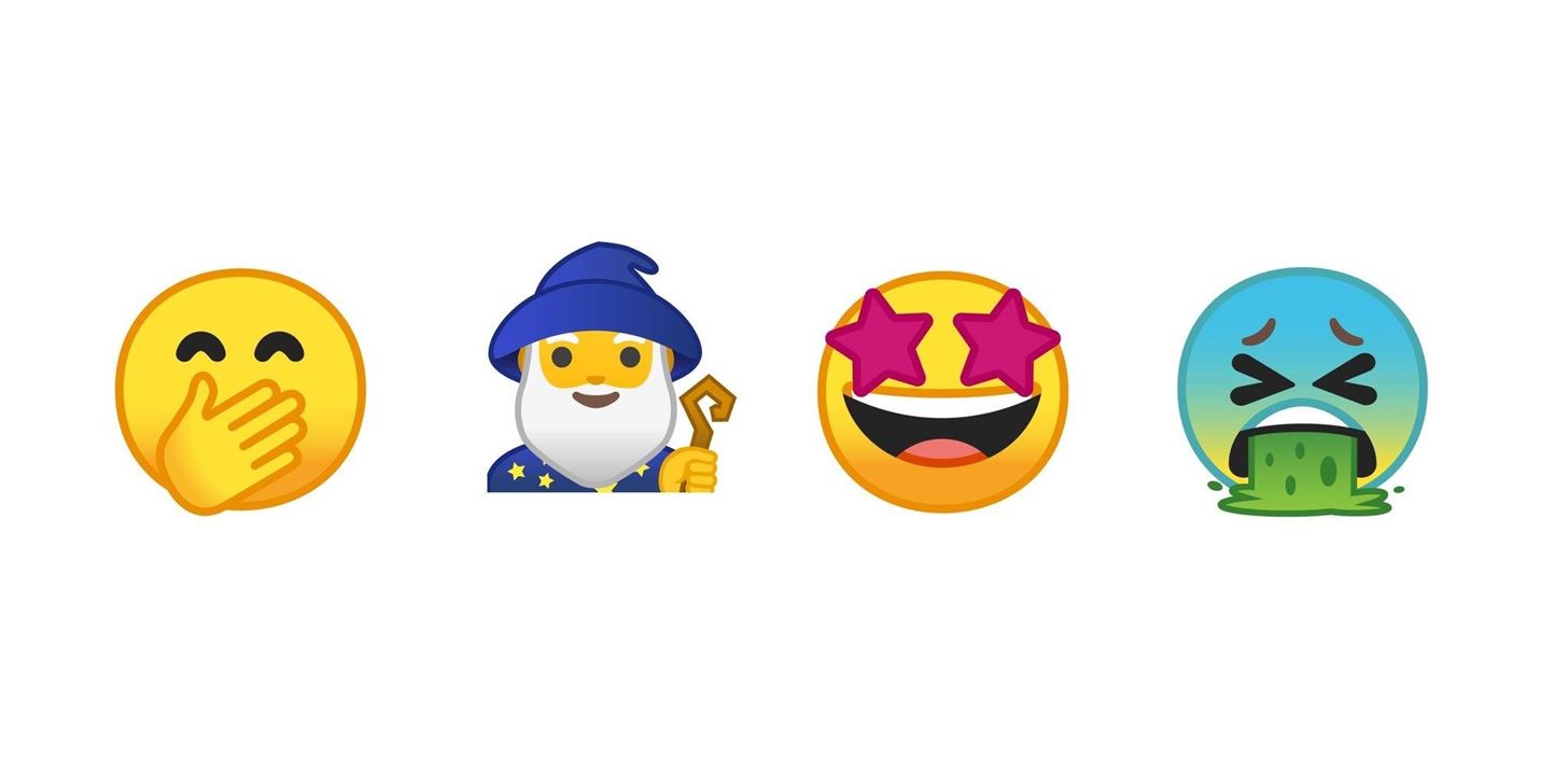
The small tweaks continue with the media notifications, they will now change colour based on the media you are consuming. The notification screen has also been changed to a light grey and the notification edit tool sits at the bottom of the notification tray. A big disagreement by the consumers are the new emojis. Gone is the popular blog design and here comes the new round emojis which a lot of people are upset about, and considering how subjective of a topic it is, it can go either way.

The last big change is icon design; the option to choose between different icon designs. There are currently 5 designs; System Default, Square, Rounded Square, Squircle and teardrop.
The new stuff
Android Oreo received plenty of new features and perhaps the biggest and noticeable one is picture-in-picture mode. This puts any video you’re watching in a little window which you can move around the screen. Again, Samsung came out with this feature several years ago.
Oreo also brings to the table notification dots, taking ideas from other OEMs this time. Notification dots are little dots which sit on the top right hand of the application. Some OEMs already have them, but now it’s officially added to Android. Much like Apple’s 3D touch, you can now long press on an app to see a short preview of the notification, along with some other options.

You can also snooze notifications, this feature was planned to be added in android 7.0 Nougat but was dismissed as it was buggy at the time. Speaking of notifications, Android 8.0 also adds notifications channels, which basically allows you to get certain notifications.
For example, if you don’t want to get text notifications of a certain app but want to receive call notifications, now you can do that.

Another new feature is smart text selections, which allows you to select an address and directly put it in google maps. It also works with phone numbers, and unknown entries will get a web search option. Downloading APK files has also changed. From now on, you will have to enable unknown sources from settings of each app you want to allow to download APK files.
Recap
Android O is an extensive update. It feels like a lot larger update from Android Nougat compared to Android Nougat form Android Marshmallow.
There is a lot of framework being put in place which should provide a lot of fun stuff in the coming years. The new notification features, the Bluetooth codex support and icon changes make it feel like a bigger update that it is. There seems to a heavier emphasis here on cleaning out the unwanted/unused features and smoothing out the rough edges.


